
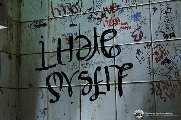
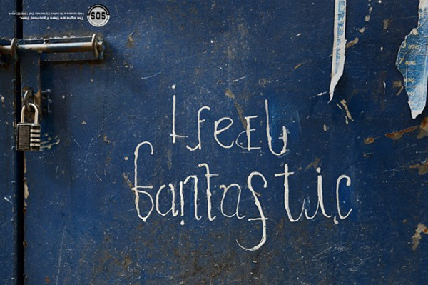
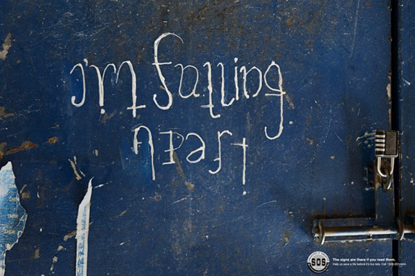
These are from an ad campaign by Singapore-based suicide prevention organization Samaritans of Singapore. The tagline “The signs are there if you read them” next to the logo is formatted upside-down so that readers know to flip the ad.
Thoughts? Feels? Non sequitur comments?


http://www.designinterviews.com/interviews/john-langdon-what-lies-beneath-ambigrams
“As an (untrained) artist I was almost obsessed”
https://abstractrelationsvi.wordpress.com/2015/12/08/entirely-related-2/