It runs like a beta—a little buggy.
Type:rider
It’s got pretty mixed reviews, but I’m digging the concept.
It’s all aboot noticing the little things.
Ted: Design Giants
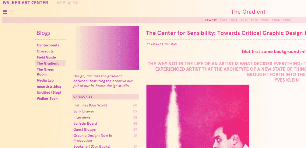
The Gradient Walker Art Center design blog
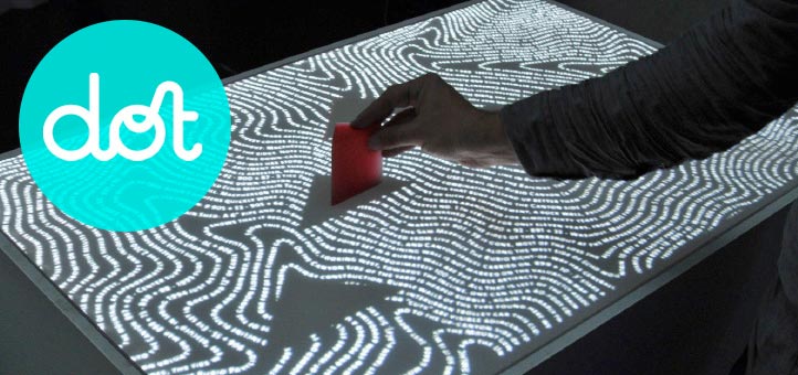
Dot
ArtCenter’s online magazine, Dot—several articles well worth a read—
Celestial Atlas by Alexander Jamieson
Sharing Information
For those of you who aren’t familiar with the blog Brain Pickings, written by Maria Popova, you should get familiarizing. It’s a great source for all types of creatives trying to tackle the creative process. There have been a number of posts there that have great answers to the question posed in “How do you begin?”
Infographics
The main reason I’m posting today is to share a recent post from Brian Pickings with Tony’s 8am class as well as my classmates in the survey. I know the seniors have been exploring infographics and I thought you all might find a lot to take away from the blog post. It mainly focuses on David Byrne’s introduction to a recent book on infographics, The Best American Infographics 2013.
My classmates in the survey class should check out the post as well. It could inspire some interesting approaches to our current instructional design project.
Segue into discussion
In yesterday’s out of class classmate discussion, we shared books, magazines, and image catalogs that we all use as sources for design. As I said, Brain Pickings is a great blog for all creative types. I just wanted to open up the conversation on the blog as well. Are there any books, websites, etc. that you would like to share? Websites that feature a wide range of graphic design that I use are Behance Served Sites and Creative Roots. Also, I really take a lot away from the podcast Design Matters with Debbie Millman. It’s a “thought-provoking internet podcast, which profiles industry-leading graphic designers, change agents, artists, writers and educators.” It’s been going on for a number of years and has built up a huge resource of interviews packed full of information.
Are there any sources you would like to share?
Gravity
Via The Credits website: One of the Greatest Cinematographers Ever:
Gravity‘s Emmanuel Lubezki.
And Director Alfonso Cuarón and Re-recording Mixer Skip Lievsay on sound:
SoundWorks Collection: The Sound of Gravity from Michael Coleman on Vimeo.
Box
Box from Bot & Dolly on Vimeo.
Did you ever notice that the scarecrow has a gun in the Wizard of Oz movie?
Hello world! My name is Lila. I’ve got rainbow hair, a small piece of titanium through my right eyebrow, and a neutral facial expression that frightens grown men. My roommates mock me because I like to sit in the dark, and my biggest fear on a day-to-day basis is smelling bad. Anyway, enough formalities.
I think that a lovely and productive topic for discussion would be motivation.Oh man, what a nice buzzword, right? Such a well-traveled path of discourse for any career choice.
“Oh I chose to [blah] because I think that the world needs more [hurg] and I think that I can help with my interest in/ability to [flargh.]”
Yeah, no. This has no value to anyone. You have specific reasons why you are walking in this manner on this particular road. The recognition of these reasons, or conversely, realizing that they are superficial, false, or wholly absent, is what is going to propel you to actually go somewhere with your “career.”
I hardly care to delve into the justifications for being an “artist” or wanting to “create,” as these definitions have broken down into broad, debatable parameters and would make anyone outside of the “art world” gag at the pretension of such particularized abstraction. Instead, I would like to attempt to precisely dissect personal inclination to design.
As a wee thing, I found myself fixated on labels and displays in stores. (As I reminisce, the specific image of the Tongue Splashers packaging comes to mind.) I was amazed by the fact that a shiny bag with pretty colours could draw me in and make me want whatever was inside, even if closer examination proved my complete lack of interest in the product. I was entirely content to simply stare at the glossy printed cardboard and ponder the appeal while my mother shopped. In clothing stores, there would often be no flashy boxes or plastic bubble packages to amuse me, so I instead would sit and poke my fingernails, bemused and intoxicated by the way the nail bed turned from pink to white then back again with the application of pressure. The checkout lines at grocery stores were my favourite. The shelves full of tabloids and candy and impulse-buy items were my primed canvas. The cashier’s eyes would flick over to me with vague worry as my dearest mother would seemingly disregard her four-year-old near so many small items with pages to be ripped or sugary contents to be consumed. True to this very day, I had little to no interest in cheap confections or the lives of the socially elevated. I instead wanted nothing but to fix these few cubic metres of the world: to right all of the wrongs in this one area. So I began my work. I tugged each package of Skittles to be as smooth and uniform as possible, and then I carefully lined and stacked them to look just as they should in an advert. Every pack of Trident and Wrigley’s had to be all parallel and perpendicular to all the right axes, just as the person who created the packaging had intended, for maximal spacial efficiency. Even after my mother had received her receipt, crinkling bags of consumables, and her change, I could not leave my post until everything was in its most organized and appealing place. Ah yes, sweet satisfaction it was indeed. My mom would roll her eyes with affection and sarcasm as the cashier would often chuckle at my strange hobby and designated determination.
There are pictures of me from when I was in pre-k, from a particular day when I was playing with these little plastic shapes. Each shape was geometrically regular, and all of the sides of each shape were equal in length to those of all the other shapes. Thusly, they were able to mix and tessellate. I had created a few patterns with different combinations and arrangement of shapes when my teacher came by. Her jaw dropped as she witnessed the complexity and precision of my little floor creations. She demanded that I do not change a single one while she scuttled away to find her camera. I was also required to leave them as and where they stood until the day was over so that my parents could see my work. Leaving the mess out after cleanup was agonizing.
My elementary school art teacher let me sit and work at her desk when she saw that I actually managed to give two shits about her class, and how much the interruptions and intrusions of my less-motivated table-mates upset and distracted me.
Another pivotal moment that I remember with clarity was sometime in early middle school. I had developed an infatuation with hazelnuts. There was great gratification to be had when one could split the shell perfectly in half without breaking the nut within. I filled a small dish on the kitchen table with perfect shell halves, and shamefully carried each jagged failure to the rubbish bin so that nobody would easily see my downfalls. I examined the perfect halves and was struck with the image of tiny fat sailboats. Cue the montage of skinny little me darting around the house to collect a loaded hot glue gun, copy paper, a cereal bowl full of water, and toothpicks, then reconvening with my supplies. I tucked my ponytail into my shirt (my then-brown hair literally extended down to my knees when standing) and began working. I carefully cut each toothpick in half (with the same concealment of failure system from the hazelnuts,) folded and glued a paper sail around it, and glued it to the exact centre of the inside of the hemi-shell. I then plopped my adorable tiny fleet into the cereal-bowl sea, and silently reveled in my accomplishment. Shortly thereafter, I became slightly disheartened by how purposeless these tiny vessels were. I realized that I had only wanted to see what such a composition would look like, and again felt satisfied by the fact that I had achieved my goal. My parents came upon my curled up form in my kitchen chair, and my mom turned to my dad and declared, “She sees something to be done, and she does it.” “Huh,” I thought, “doesn’t everyone?”
Later middle school and early highschool brought with them the preambles of the explosion that is social media. With this came the requirement of frequent and thorough documentation of ones appearance. I still have yet to master naturalistic facial expressions, and puberty had smacked me upside the complexion. The discovery of Corel Photo Paint on the communal family computer was like that of some kind of religious awakening. Whaaaaat? I can un-pizza my face? I can make my eyes greener? I can make the world more colourful and high-contrast? Sweet merciful technology, this was gorgeousness and gorgeousity made flesh. Contrary to my expectations, this did not make me any less socially undesirable, but my time was too blissfully occupied and passed with scrubby sliders and masks and gaussian blurs to notice too much.
Again in middle school, I was pulled from the flock of my art classes with three other hand-selected students to work on a mural for the hallway, rather than drawing landscapes or plastic fruit or extreme-perspective roadways. Apparently I had some kind of elevated ability. I just assumed that I had consciously decided to put effort into my classes. I was being graded, I knew I was capable of making quality work, and I came to school for the purpose of learning, so why would I choose not to? That would be an illogical waste of time.
Then came high school. With my electives filled by Spanish and orchestra, I basically disregarded “art” for three years. My agenda was filled not with assignments, but with extensive doodles and patterns expressing the purest moments of boredom in classes that were too easy and slow. I had given up on trying to dress like the people of middle school who had friends, and instead based my personal aesthetic on others who I would see and promptly envy solely on the basis of their appearance. There was a senior in my lunch period named Scott who was in a punk band. He wore only black and white, sewed his skinny jeans to be absolutely skin-tight, and bleached sections of his black hair to white in different, immaculate patterns every few weeks. Needless to say, I was infatuated in every sense. I realized that I could wear three shirts at once, each of a different pattern, cut, and colour, and by golly, it was not flattering, but it was fabulous. The introduction of hair dye to my life was nothing less than monumental. In my junior year, I wore a different costume every Friday, because I love the concept of costumes, and I had the capability and resources to do so. (My AP Lit teacher absolutely lost it when I came in as Hester Prynne, complete with a doll and sparkling “A” on a floor-length dress.) That year, I had an entire page in the yearbook dedicated to my appearance. For senior prom, I knew that I would never find “the perfect dress” that would fit both my body and my funds, so what choice had I but to make my own ensemble (gee, I was so hard to spot in a crowd.) Yes, the top is made of duct tape, yes, those shoes are seven and a half inches tall at the heel, and yes, I was a runner-up for prom queen (worry not, I was homecoming queen the year before, and won the yearbook superlative for “most unforgettable.”) My psychology teacher literally jumped back in surprise when she entered the room and saw that I had chosen to don blue lipstick. Anonymous schoolmates on the internet made such claims that they too could stand in their closet in the dark and clothe themselves with complete disregard for coordination or ideas of tackiness. I just laughed and laughed, knowing how dang GOOD I looked. Once my schedule had openings, I filled those with the required “intro to art” and Sculpture I. The former was taught by an obnoxious spacey stereotype who complained that perfume gave her migraines, and asked me to stop wearing any (see the fourth sentence of this post.) She also held strong to the claim that red, yellow, and blue were the true primary colours. Needless to say, we did not mesh well. However, I maintained a 100 in the class, because I could. My sculpture teacher, on the other hand, was delighted to have a mentally engaged student. I worked at his desk instead of with other students, while he and I heatedly debated absolutlry anything that came up. He liked to argue, and I liked to humour my teachers. He gave us weekly sketchbook assignments, promising that he would be checking and grading them every Friday. I completed each one by its designated due date, but soon realized that he didn’t actually care that much, and usually checked the bulk of them at the end of the semester. I had none of that, and on a weekly basis would literally shove my work upon him demand that he evaluated my efforts so that I could be both internally and externally validated. Another 100 on my report card.
When the list of fourteen students accepted into the Graphic Design emphasis for the Spring of 2012 was taped to the door of N215, and I had realized in my anxious panic of waiting that I had no other backup major, no alternate life I could pursue, my heart stopped as I watched Ms. Roberts walk back to her office. I dashed to the piece of paper on the door and instantaneously sobbed thrice as hard as I did when I met Patricia Quinn at Dragon*con the year before (and that was pretty dang hard.) I saw my name there and that meant that my life was moving forwards and that I would be who I was supposed to be and never again have to wear navy blue Abercrombie & Fitch shirts and grey pants in an effort to feel like I had a place and a function on this planet. I was verbally incoherent for an hour after that as I shook and sobbed on the bridge that connects the North and South wings of the second floor of Lamar Dodd. I’m not frequently overwhelmed by emotion, so when it rains, it pours.
Sweet jeebus I really went off there. Oops. So much for “precise dissection.”
Anyhoo, through all of this, what are the common themes? A seemingly inborn, inherent desire penchant motivation NEED for organization, achievement, visual communication, for colour, purposeful expression, validation, manipulation, entertainment, (et cetera and so forth,)
for
d e s i g n.
So.
Why are you here?
Encouragement via Ira Glass
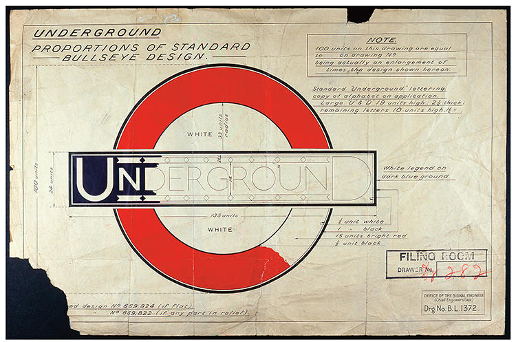
Mind the gap
From Fast Co. Design: The Amazing History of London’s Most Enduring Logo
RSA Animate
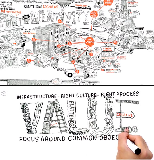
RSA talks illustrated: http://www.youtube.com/user/theRSAorg
Best to view full-screen to catch all the details.
- Re-Imagining Work: http://www.youtube.com/watch?v=G11t6XAIce0
- The Power of Outrospection: http://www.youtube.com/watch?v=BG46IwVfSu8
- Changing Education Paradigms: http://www.youtube.com/watch?v=zDZFcDGpL4U
- RSA SHORTS – The Power of Quiet: http://www.youtube.com/watch?v=rUaj7rj6MI8
Studies and Processes from the 50’s
Here is a link that contains several free Andrew Loomis books that have been converted into pdfs for easy downloading. Andrew Loomis is an illustrator and draftsman from the 50s and 60s. The first book listed, Creative Illustrations, contains in depth studies of Line, Tone, Color, and Creating Ideas. I skimmed through the book and thought the material to be interesting and helpful. It offers different processes and techniques on composition as well. I just wanted to share it with all of you. Hope it helps you in some way!
http://illustrationage.com/2013/04/02/free-andrew-loomis-art-instruction-downloads/
How do you begin?
I am struggling with the most essential question: how do you begin? I can’t even write this without overthinking how to start. You find yourself so intimidated by a blank canvas and a thousand potential directions. You edit and re-edit until you get frustrated and throw them all away, because after a certain point you feel like you stop making sense. So how do you solve that?
I met with a handful of classmates to talk about brainstorming and problem solving strategies. Where do you begin? How do you decide how to proceed? Everyone seemed to approach it differently, but everyone seemed to gain something learning how others worked. It seems to me that students can learn more studying other artists’ process than they can by studying their finished pieces.
So here’s what we got out of it:
Writing can open up your mind. Word associations, literary devices, synonyms, antonyms, onomonopias, hyperboles, personification, etc. Making lists and checklists, write critiques, recording things and returning to them with a fresh mind later.
Remembering the principals and elements of design to help hone your purpose and help eliminate superfluous features.
Relating imagery to push things farther. Get weird with it. Using google image search or looking through your own library of collected photos or artists can take you places you weren’t expecting to go. Setting up your workspace to be surrounded by inspiration, weather it’s from artists or your personal experiences.
Creating limitations for yourself with mediums, elements, etc. so that you are forced to experiment with what you have. It will keep your experiments controlled and force you to work differently.
Making duplicates with slight variations in composition or color. This can create dialogue or solutions for later projects. Using digital tools can help you visualize variations quickly without altering the original. Or make adjustments with elements and experiment with layers using tracing paper if you prefer to work with paper.
So how do you begin? How do you simplify a thousand possibilities?
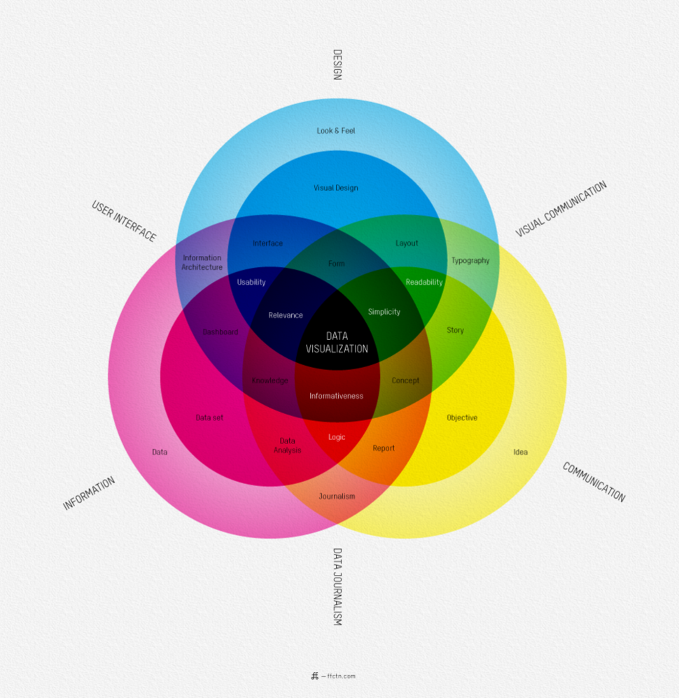
Venn It Matters (apologies)
By Ffunction. Via Gizmodo
LES MACHINES DE L’ILE
In the category of surprising + wonderful places (and things):
http://www.lesmachines-nantes.fr/en/
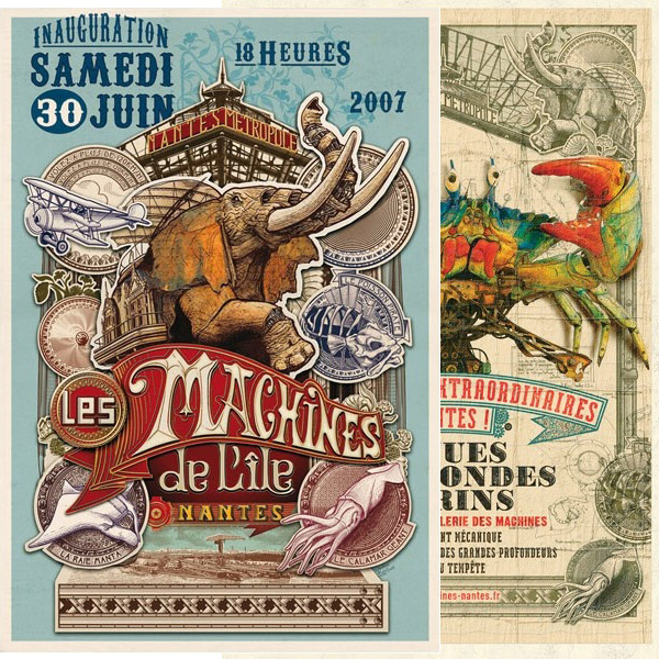
You may remember the picture of the huge spider walking through the streets. These are are the designers and engineers who are responsible for it.
Pinterest boards: Information Design | Information Visualization | Data Visualization
Tracking Consumption
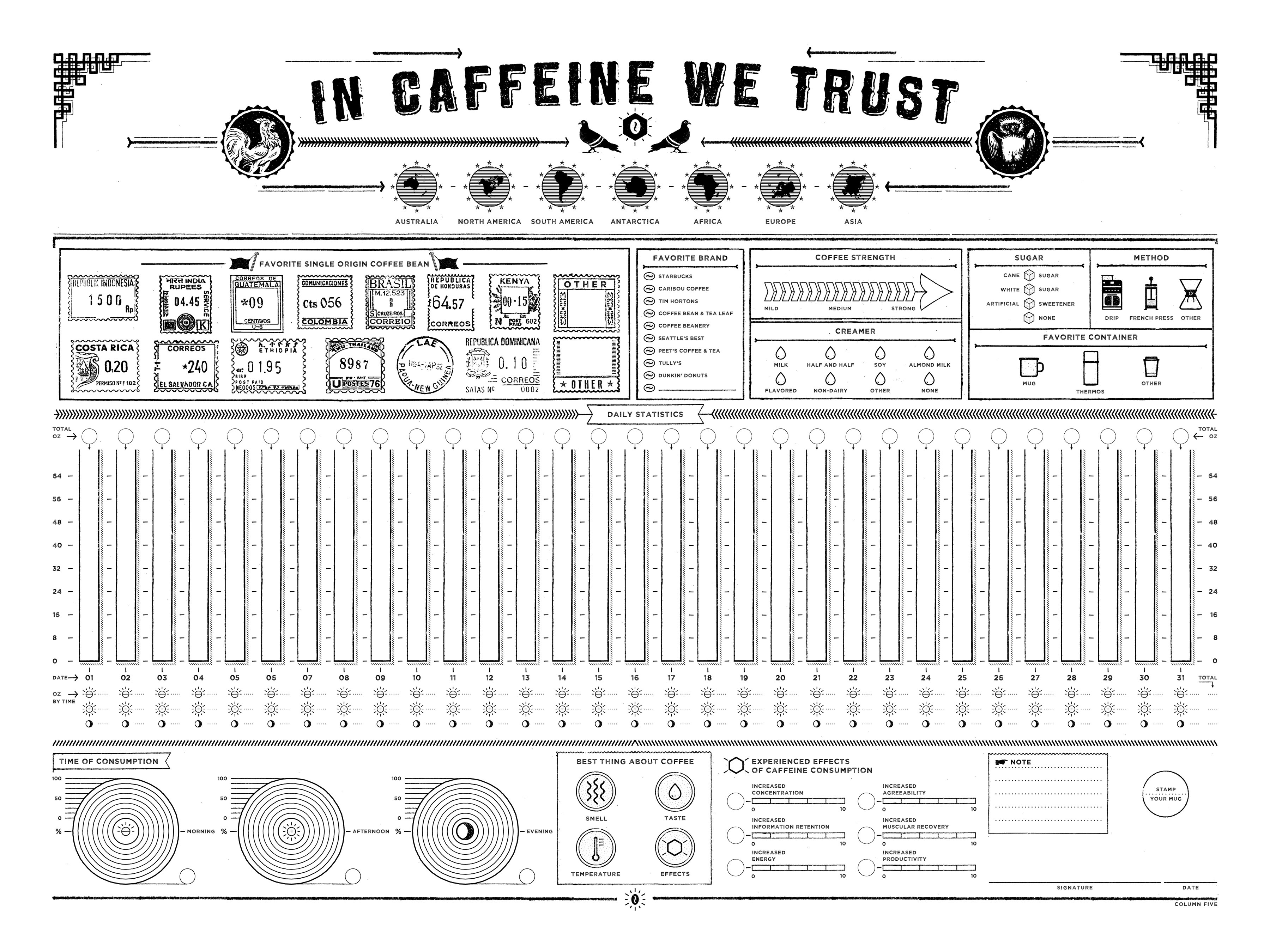
We’ve discussed tracking media consumption. Here is an elegant way to track your coffee consumption: http://columnfivemedia.com/in-caffeine-we-trust-infographic/
Facebook Group for ARGD2010
A Facebook group has been started by members of your class and you may join it here: https://www.facebook.com/groups/562506500471707
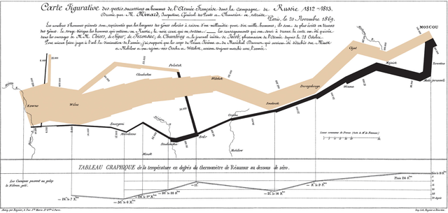
Minard’s diagram of Napoleon’s March to Moscow
Wonderful Info Overload
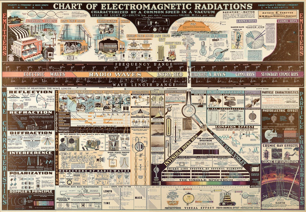
Larger version here
More charts here
Some montage and collage. Always good ideas and images here—butdoesitfloat.com/index/filter/collage
Test your “COLOR IQ” — I did OK but my eyes started hurting so I let the refinements go. I would suggest lowering the brightness on your screen a bit.
What about the WEB?
We have had general discussion about web design, interaction design, interface, UX, etc. in both classes (2010 and 4090). As a way to supplement time in class and work within the media we are discussing, let’s use this post to share questions, links, comments, and anything related to web.
This site is a default template (Theme) within WordPress and as you may have noticed I switched themes in the last few days. WordPress has become the top consumer content management system (CMS) and is something you will most very likely work with in practice.
Aside from what may too easily be called tools or software, we can talk about the media and technology cultures that consider user-exerperience (UX) and all the ways that cellphones, computers, and other screen devices change the ways we work, have fun, talk with one another, learn, read—do and conceive of anything now.
This site is a place where you can talk between student groups that normally do not have an opportunity to design, crit, learn, and get to know each other. This expanded means of creating community can be beneficial in many ways. It allows you an introductory study to consider how your face-to-face communication is different than it is online. I have asked some of you to track your media consumption/use—what and how much do you watch, play, and consume online, on-screen? Watching your patterns of use can help you approach your design work in new ways and consider how others may use it too.
We had a great talk yesterday in 2010 about process and language and managing complexity in your studies—not getting too overwhelmed with all the variables. Comparative literature was mentioned and we talked about how to organize by comparison and work-through/integrate the range of contexts one must consider. This “must” is a positive! In this regard, begin to compare how you design in, think about, and define print, motion, and interaction design. How can you work across each and have them influence each other? All good stuff.
I have made a few suggestions about places to begin—what’s on your mind?


