The full version of the talk can be found at YouTube.
An excerpt from Beautiful Losers
For those who are unfamiliar with the documentary Beautiful Losers, it used to be on Netflix instant and it’s a real tragedy that it isn’t anymore. If you haven’t seen it, go see it. It’s an incredible movie and has a killer book that goes with it as well. And, as sometimes it is easy to do, I have skipped over the introduction of the book component and only recently really read the thing cover to cover. (Sometimes I forget how much I love my books. Man, I really love my books.) Point being – here’s a real gem from the intro that i’d like to share with everyone. These artists are using form, color, and content to convey their messages through illegal and guerrilla methods, plowing forward fearlessly and embracing their craft in the process.
And here:
“The fine arts are in need of genetic infusion. The field is struggling, and it is littered with ailing institutions and anemic programs. The recent economic downturn and the re-direction of funding priorities away from the arts to more tangible causes have contributed to the field’s overall poor health. However, financial distribution alone does not explain it’s current malaise. The field is failing precisely because of a certain kind of success. The modernist enterprise has run it’s course and we have won our acres of perfect white cubes in theme park-like museum enclosures. And into these high culture biospheres, we place art that has little meaning in the wild, outside of these artificial environments. We have established a system of art academies that produce trained professionals whose artwork has become increasingly too mannered, too removed from connection with the everyday and too encoded with self-referential knowledge. These works are failing to compete with the compelling raw energy, imagination, and speed of material culture. At the moment, the visual arts are in grave danger of becoming something like ballet.”
— Thom Collins and Rene de Guzman
And, it’s to be argued that some of the most important movements came out of the mid 1980’s- the birth of zines, skateboard graphics, t-shirts, album artwork, break-dancing, graffiti, punk/hardcore music.. the list goes on. I have to remind myself that the work that I make doesn’t have to be so serious to put on a wall. The imagery coming out of these cut and paste amateur creations are so rich and captivating. Sometimes, it’s best, in the infamous words of Satoh, to just vomit it out.
*Side note- if you love type, check out Margaret Kilgallen. Her ideas of how the world is a place “grotesquely oversaturated with information and images” and how her solution was to create her own personal “info-babble” is just the tip of the iceberg for her stunning visual confusion that is just truly spectacular.
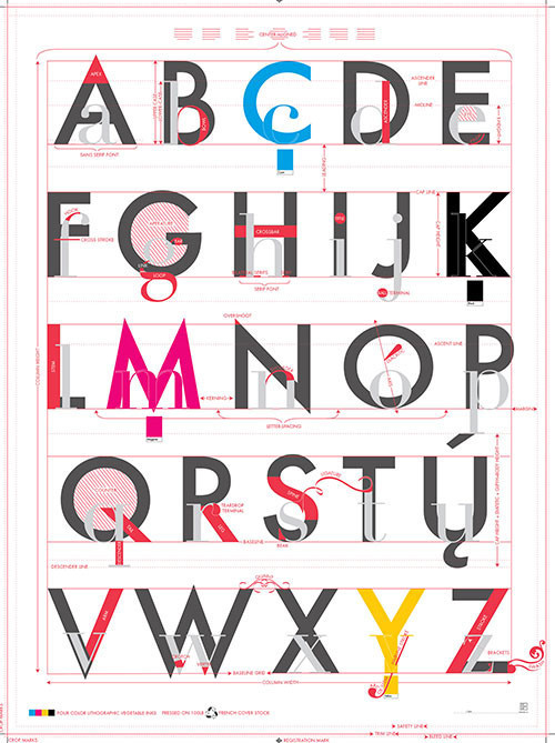
Graphic DesignStudy Sheetscourtesy of AIGA
Man With A Movie CameraDziga Vertov, 1929
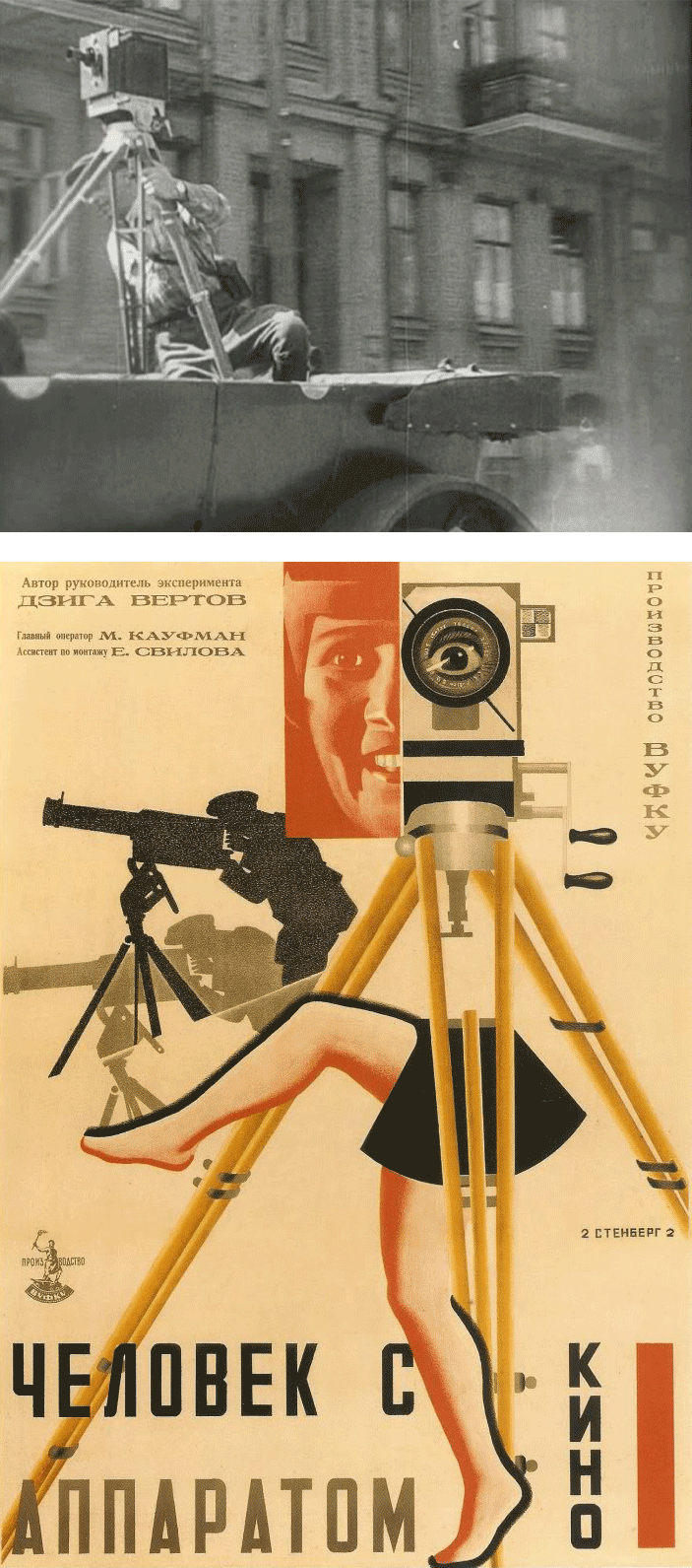
This version has a new soundtrack added in 1996.
You can find the original on YouTube or at Archive.org.
Земля людей Артавазд Пелешян
Artavazd Pelechian
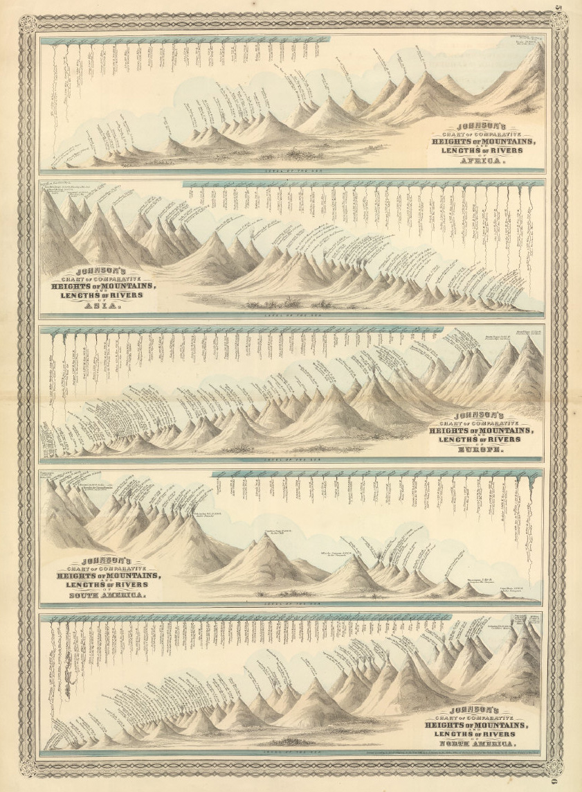
Information Design:Heights of MountainsLengths of Rivers
Here is another fascinating set of maps from the David Rumsey Historical Map Collection.
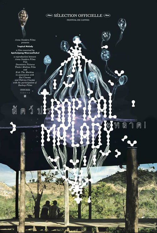
Tropical Malady, movie posterM/M Paris

Design Manifestos
A partial history of designers sorting out their values and putting ink/press to paper.
El Lissitzky on typography from 1923 and some thoughts on his future-cast at Eye Magazine:
- The words on the printed surface are taken in by seeing, not by hearing.
- One communicates meanings through the convention of words; meaning attains form through letters.
- Economy of expression: optics not phonetics.
- The design of the book-space, set according to the constraints of printing mechanics, must correspond to the tensions and pressures of content.
- The design of the book-space using process blocks which issue from the new optics. The supernatural reality of the perfected eye.
- The continuous sequence of pages: the bioscopic book.
- The new book demands the new writer. Inkpot and quill-pen are dead.
- The printed surface transcends space and time. The printed surface, the infinity of books, must be transcended. THE ELECTRO-LIBRARY.
Graphic Design Shows
Just a reminder of two graphic design shows you may want to visit—
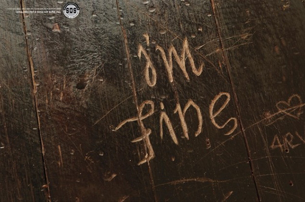
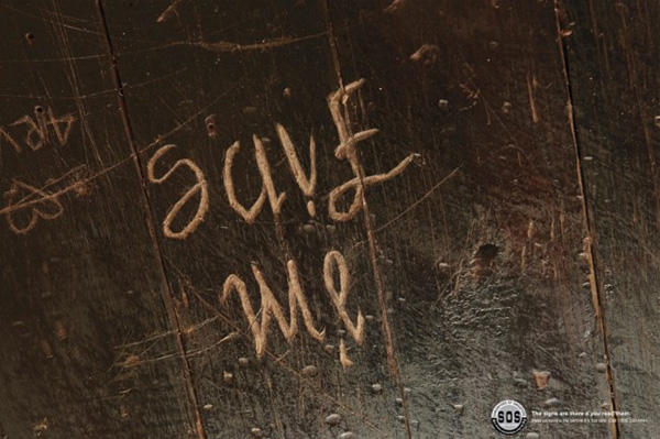
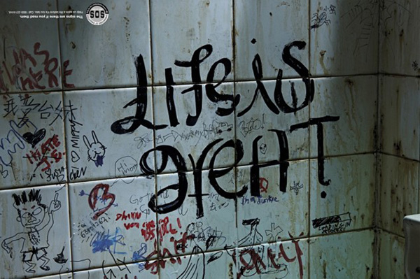
Not entirely relevant to class, but very clever adverts
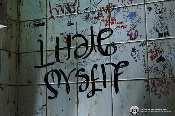
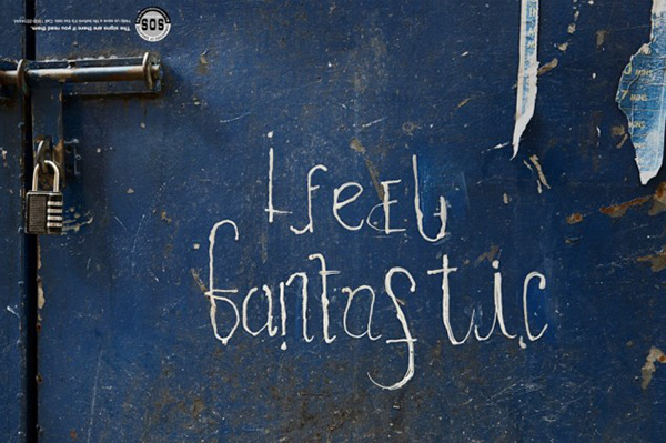
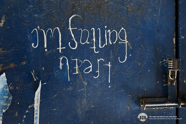
These are from an ad campaign by Singapore-based suicide prevention organization Samaritans of Singapore. The tagline “The signs are there if you read them” next to the logo is formatted upside-down so that readers know to flip the ad.
Thoughts? Feels? Non sequitur comments?
The consequences of multiple open h3 tags
Learning Coding Basic with Scratch
MIT create scratch to teach young children about programming and interactive design. I played around with it and I thought it was fun and that it would be a helpful way for those interested in code to learn some basic concepts that are use in pretty much all programming languages. It’s free and sort of simply after you go through the tutorials. Hope this is useful to some.
Pop Chart Lab
Check out these (mostly) pop culture info prints. The cheese chart is nice.
well worth a read—AIGA, direction, language, purpose, more
Less than a day ago, Design Observer posted an open letter from several past AIGA presidents, medalists, and board members to the AIGA and its current board. I hope you will read it. The letter concerns the proposed sale of the AIGA national “headquarters” building and a campaign which pits a characterized old static mindset (“status quo”) with a new and seemingly current, relevant way forward (“transformative”). Read language from AIGA to members.
Of the many issues, here are a couple. First, there are perspectives of what the building allows given its location and street-level access for those to easily look in and maybe learn something about graphic design. It is accessible and hopefully functions to both educate and inform. Some who have replied to the letter have noted that the AIGA HQ could be located in Washington DC or distributed among several cites—either permanently or within a more fluid model that would allow it and its engagement to move around, be more involved in several communities directly.
It has also been mentioned that it could reside on a university campus to be directly connected to students, the physical resources of a university, and the events, research, and full activities of a learning environment. One of the reasons UGA is appealing for students and faculty is that it has invested in locating the Georgia Museum of Art with the performing and fine arts programs. It is a great asset to you all for the GMA to be so close and I hope you take advantage of it weekly!
Probably the most important issue to be raised is the strategic plan for the organization. AIGA and its members have struggled to hold a meaningful and inclusive definition of what AIGA’s mission should be or is. With the radical changes in graphic design over the last 20 years and the expansion of specialization within it and around it, this has been no easy task. In the past, there have been splits along a couple of lines—one between new and old media and another mirroring this media split but going deeper into the validating/“justifying” design processes that consider fuller contexts of use, appropriateness, function, research, environment, value. Yesterday I spoke with one of the senior groups about those who purport holistic approaches to design and context but are very quick to distance themselves from fashion.* If a holism, then a holism, no? We love to edit as much as we like our static and coveted locations or our need for familiar (read: comfortable) definitions of what it is we do and who we are. Safety first for us humans—even in the “creative” cliques.
AIGA kept the acronym but tossed out its original focus when it newly qualified AIGA as “the professional organization for design” and not “American Institute of Graphic Arts.” This was done in part to respond to the expanding ways people read and watch words and images. In all of this, I ask why we as designers and design students cannot move from a binary way of thinking—it is either this or it is that. In the case of media and context, it has been decided for us. There is no choice no matter how begrudgingly we do not like the new landscape nor how befuddled we feel by it. The people have spoken for good or ill. It is both/and, not either/or.
It is page and display, fast and slow, high and low, here and there if we like it or not. If we find comfort or validation in what we do, know, make, value, and advocate or not.
––––––––––––––––––––––––––––––
* I am not suggesting one do/design everything nor provide a depth of study in every mode of design. That is not the point. However, when we claim a holism, there is a responsibility to consider the full range of design activities, cultures, disciplines, mindsets, forces, economies, values and their place within the whole. Also, when it is our place to deal in definition, form, and presentation of our ideas, we must be aware of the contradictions we so easily expose. A quickness to define what one is not when one claims holism, is the immediate point where ethos is blown. And further in this line of definition, what choice is there between “status quo” and “innovation” — really? We can do better than divisive binaries or non-choice.
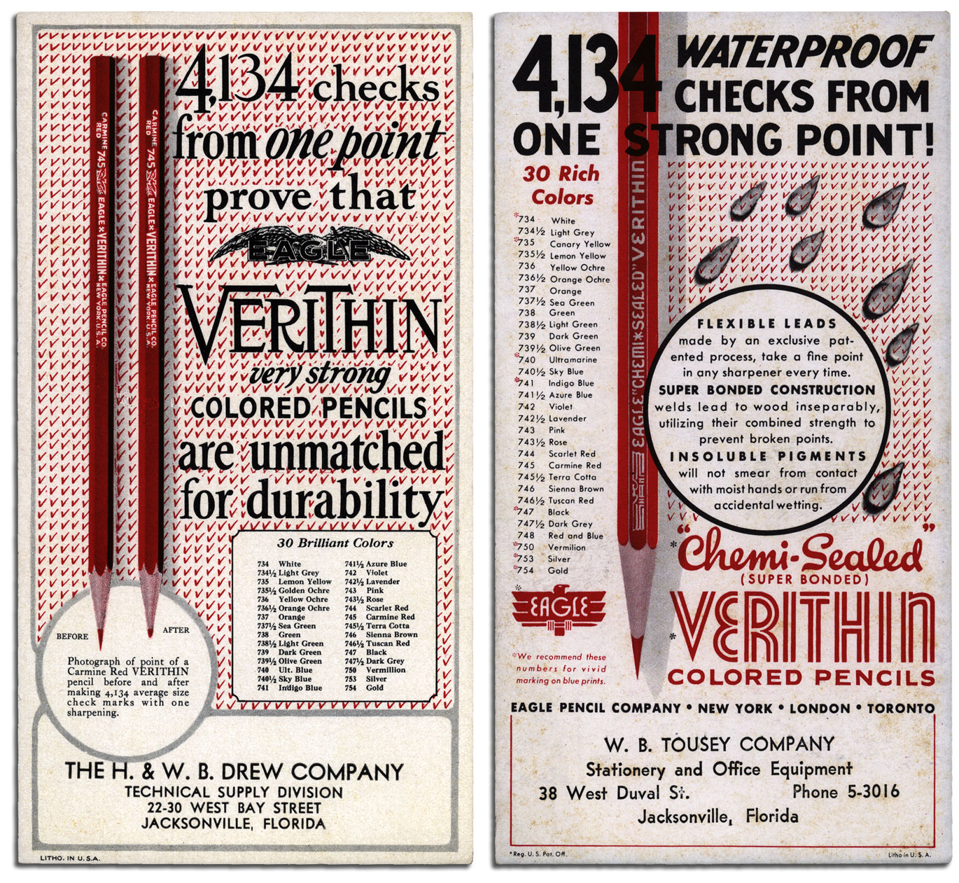
4,134
Learn Code
![]() It has been a while since I visited Codecademy’s site—maybe a year or so.
It has been a while since I visited Codecademy’s site—maybe a year or so. I followed them for a while when they first started up. The W3Schools tutorials are useful for the novice coder, but these folks have some super nice features. Go check it out. Whew—I thought I was missing something and I was: the rest of the story. Check out both and see what you think. All of this includes a lesson in brand. Code Academy is now the Starter League and from what I recall it was a free/open-source school at the beginning—not so much the case now. Check them out and let me know what you think. Brandon has also suggested Scratch from MIT.
More Water Maps(these are close to home)
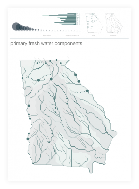 Over the last few days I’ve posted several information and educational design references. Of those, two had focus on water—where it flows and how much there is. Hope you have put the study on them and found good reason.
Now here is a third submitted by Hannah with a view of Georgia. Take a look at the full range of work at: Slaughter Studio.
There is more to this story—I am sure of it.
No?
On Simultaneity
The future is already here —
it’s just not very evenly distributed.
— William Gibson
Are we taking a break from striving for perfection?
Over the past few years we’ve seen a reemergence of vinyl records and a growing popularity of filters on Instagram. Members of other generations (i.e. my father) have reacted to this trend with a large amount of eye rolling. We’ve made all this progress in the hopes of getting a perfect and clear sound and image. Why would we want to not use it? I have an app that’s purpose is to add dust marks to a photo. Is it nostalgia for a part of the past we only got a small taste of? Is it a need to grab on to the physical world that we rarely get to experience at this time?
Joost Grootens
Check out his portfolio of atlases—wonderful design.
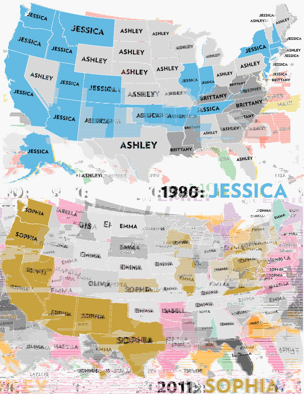
Name Map, plus
Information design map: Six Decades of the Most Popular Names for Girls, State-by-State
If you view this link in an older browser, you may be entertained by some glitch art.
For DIY glitch experiments: JPG Glitch
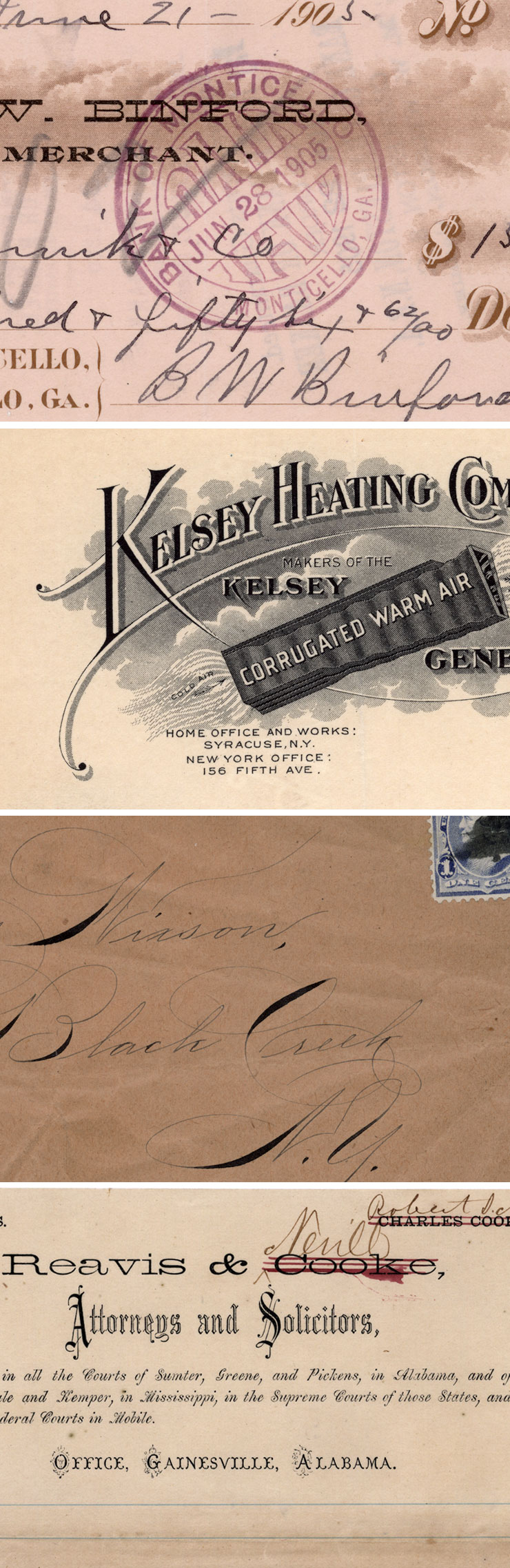
Marks on Paper
Some paper ephemera found yesterday.
“post more to the blog.” “okay.”
Personal notes on today’s class: there is a significant difference between cornflower blue and cyan.
Also: “nother” as in, “A whole nother,” is not a real word.
Who’s down for some silly metaphor and story time? I know I am. Gather ’round, children.
On Saturday, I really did not feel like actively designating my mind to do anything too stressful or purposeful. I began my day with a regular dosage of reddit, Slaughterhouse Five, netflix, and working through another page in the stack of AJC Sunday comics that my mother collects to give me every time I visit. This is irrelevant but it’s setting the tone for how little I did on my Saturday morning. Roommate Ryan emerged from his room and asked if I wanted to finish Resident Evil 5 with him today.
I said sure.
He said “Or, do you want to climb a rope with me?”
Uhh, yes.
Well what do you want to do first then?
Climb a freakin’ rope, now.
30 minutes and a small chunk of flesh from my hand later:
“Gee Willikers. I really do not have the upper body strength for this, but I’ve realized that I can climb up the side of these stairs, instead of using those 8 steps on the other side, and that’s pretty cool!”
Do you want to go climb the brick wall behind our apartment?
Uhh, yes.
So we went around back to the wall, which has an odd kind of stair-step structure to fit the preexisting landscape. This means that you can choose which height of wall you’d like to challenge. I first went to carefully climb a bit that was around six feet high, slowly locating sturdy footholds and being quite conscious of how close my beautiful and expensive teeth were in relation to the top corner of the brick. I made it up and felt pretty good aboot myself. Then Roommate Ryan told me that it’s so much more efficient and fun to actually scale the wall.
Well surely, thought I, I’m not capable of such a thing, I cannot even climb a rope. I clearly do not have the kinesthetic capacity.
No really, your body knows what to do. Just run at the wall, plant your foot on it, then pull yourself over.
But what do I grab onto? What if my foot slips? My steps aren’t going to line up and I’m just going to realize that halfway through and I’ll admit defeat then turn around and try it again in a vicious cycle of chicken!
This happened, as I predicted,
because I predicted.
Lila, I’m watching you over-think it before you run. Just GO.
—but—
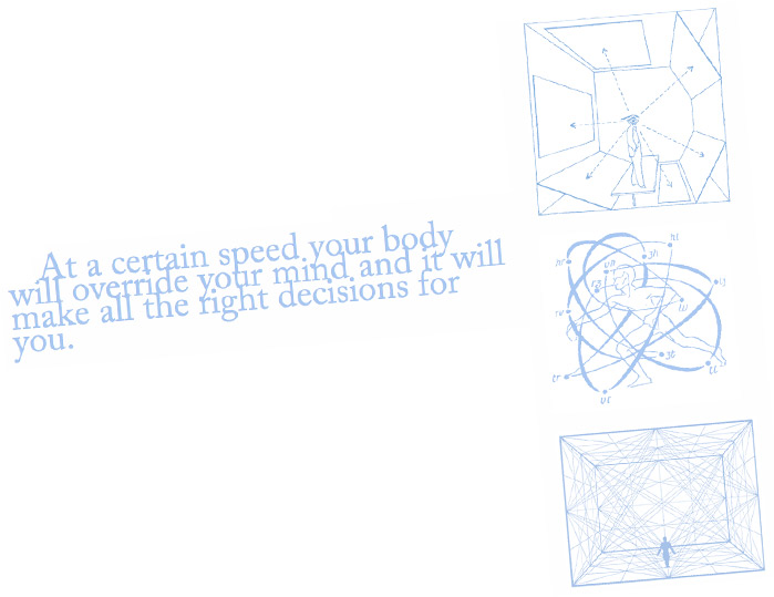
nope. At a certain speed your body will override your mind and it will make all the right decisions for you.
Roommate Ryan is secretly a trove of infinite applicable wisdom.
So I ran. I didn’t smash my teeth into the wall. I didn’t slip. I just scaled a 6 foot wall on the first try. So I did it again. And again. And yeah, I started thinking and missed a couple of times, but I was having so much fun and self-satisfaction that I managed to turn the thinking off again. Then I shifted over to the 7 foot bit of wall. Second try: I did it.
Done.
With a few scrapes to remind myself of my great personal victory.
My victory that was not thinking
but
doing.
This is what will yield your personal best results in design, or any art form for that matter. As Ira Glass said in that video I posted a while back: “Your taste, the thing that got you into the game, is still killer.”
Unfortunately, your “taste” is naturally filtered and “refined” through your judgement, expectations, standards, fears, inhibitions, education, and a whole mess of other mental sieves that whittle down your output abilities to something that you absolutely know is below you.
This is a wall for which I personally have yet to master the scaling technique, but I know that I do have the potential, and with continuing practice, it’s not an unreasonable goal.
Creativity

s0urce c0de


On Space and Shapes
?
On Text
Type is all nice and fine but I’ll take text any day.